Oh, hello. Thanks for reading. It’s me, Heather. I’m coming at you with the Word. It’s “apply” if you haven’t figured it out yet.
I feel like spring has sprung. Everything started blooming like 3 weeks ago and my sinuses weren’t ready. With spring in the air, that always means things start happening in Augusta. I don’t just mean the Masters Golf Tournament; I mean arts events. There are a barrage of local, visual arts showcases and opportunities out right now, it’s really hard to keep track. You can find a good bit of them on our calls and careers page. If you know of more, please email them to me! I love to share.
But, if you’re new to the application process, you might be a bit wary of applying. I get it. I’ve been there. The imposter syndrome is strong with this one. So, where do you start?
For one, get your Artist Resume and CV together. What’s the difference? Well, a Resume is a brief, curated selection of your work that includes your schooling/education, mentorships, certifications, organizations you are a member of, awards/grants you’ve received, shows or performances you’ve been featured in, private or public collections you’re in, publications/interviews/features, events you organized, etc. This should be catered to what you are applying for (if you have the time) or at the very least catered to the “brand” you are presenting (yourself). Resumes should include dates, contact info, websites or social media and professional references, especially when you are just starting out. The more established you are, the more polished and refined your resume will become. Jury is out on how long it should be. I’ve heard keep it to a page, but as your career grows and you accomplish more, tipping into two pages isn’t necessarily bad thing. Just keep it easy to skim through and get the info. Whoever is looking at your resume likely has several to look at in a short amount of time. For that reason alone, brief is best.
Your CV is a more in depth look at you as an artist and what all you’ve done in your work and career. Where you might have stated you performed at this concert, in your CV you have room to write about its success, some data, what you learned, etc. Here you can expand on what was in your resume and include more. CVs tend to be a little longer for this reason, but still keep in mind, they are going to want to read through fast.
Something to consider, you’re applying as an artist, right? So, your resume and CV should have a semblance of flare, at least what that means to you and your work. I try to match mine with the style of my work, the colors I’m currently into, etc. It should stand out a little. If you aren’t a graphic designer, that’s totally fine. That’s why websites like Canva exist. It’s got templates ready to go for these sorts of things and more. And a lot of them are free. Which, you know, I love.
Next should be your portfolio. If you are submitting online, they will often ask for samples of your work or links to an online portfolio. So, you should have quality shots of your work ready to go. This means high-resolution images, formatted to what they need (usually in JPG, PNG is fine) in focus, with no distracting boarders or background. As a curator, I don’t need to see your dog begging for a treat in the background, or the grain on your hardwood floors. I just want to see your work.
Now, as a person who likes cute animals. You can always send me, a person, photos of your dog begging for treats.
If you are a member of the Arts Council, you can borrow the DSLR camera from our Technology Lending Library for up to 5 days to get the shots you need. Just saying.

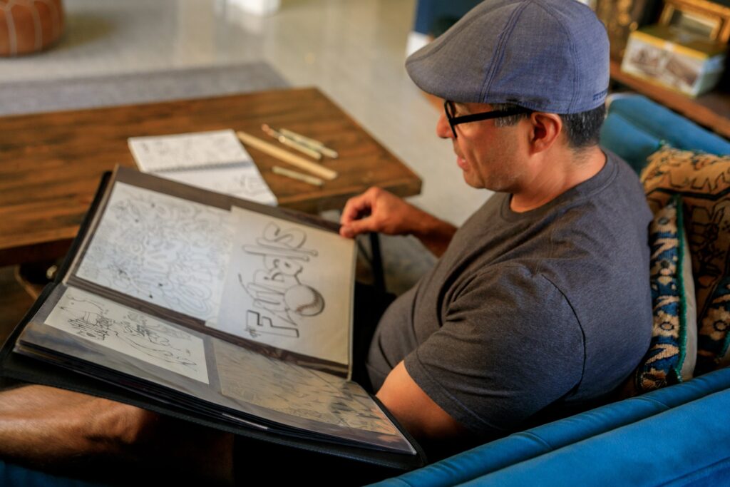
If it’s a sit-down interview, or a portfolio review prior to a show or event, it’s a good investment to have a physical portfolio of your work or a way to present your work (IPAD, Laptop, etc) while you’re there with the best and most recent of your work. Portfolios are for wowing people. You’ve lured them in with your resume and CV. Now knock em out of the park with your cool work.
When submitting via application, always read the instructions and about info. I can’t tell you the number of times I have had to reiterate something that was plainly in the description at the beginning of the form. Plus, you want to know exactly what you are getting yourself into, right?
They may also ask for a brief artist bio or statement. This should always be in 3rd person. They most likely use this bio for publication or promotion of the show, so other people will be reading this about you, so it should read that way. Keep it to about a paragraph. 3-6 sentences is totally fine, but it would really depend on what exactly you are applying for.
If you are submitting with a fee to sell work, always incorporate that pricing into the price of your work, along with any commission. You should always plan to make your money back. Let’s say you want to make $100 of your work, the fee to submit is $30.00 and the commission is 30%. You should add 30% on top of 130, which would need to be about $186 for you to make 130 after commission is withdrawn. You should also have to consider state taxes. Some galleries add it for you, some don’t. It’s always best to ask.
Always triple check your math. Especially when you need to make a certain amount of money. Do some reverse calculations to make sure you’re going to get what you need to when it sells.
While I’m at it – triple check your applications too. Don’t hit send before it’s been proofed for typos, bad grammar, wrong info, wrong images or files shared, etc. It can look pretty unprofessional to send a follow up email with the corrected info, especially when you’re submitting to places where they don’t know you personally. Don’t be that person. Just triple check your work.
Always read over the fine print. Most galleries should have a contractual agreement of what you should expect from them, and they of you. Read before you sign anything. Protect yourself and your artwork.
Lastly, get a friend to proofread for you. Especially if you’re having trouble getting things just right. Sometimes, they will see something that your brain has become blind to after you’ve been laboring over a proposal or artist bio for too long.
That’s all I can think of. I’m sure there’s plenty more, but this is a good start. Now, go “apply” to some of these cool shows coming up!
-Heather